Backgrounds, props, light and composition for creative jewellery photos that sell the mood of a piece — with eight real setups and how to repeat them.
A white-background photo tells a shopper what a piece of jewellery is. A creative photo tells them how it will feel to wear it — at a wedding, a festival, as a gift or every day. Online stores need the first; social media, campaigns and banners run on the second.
This guide covers how to plan a creative shot, choose backgrounds and props that flatter the metal and stones, light for sparkle and compose the frame — with eight real setups and the thinking behind each one.
Start with the mood, then build the set
Before choosing a single prop, decide what the photo should say. A bridal set wants richness and ceremony; a daily-wear ring wants lightness; temple jewellery wants warmth and tradition. That one decision drives the background colour, the props, the light and even the camera angle.
Keep a short brief for each collection: the mood, a colour palette, two or three props and the channels the images are for. It keeps the shoot focused, and it keeps the images consistent when a collection is photographed over several days.
Choose a background that makes the metal and stones stand out
Colour does most of the work in a creative shot. These pairings reliably flatter jewellery:
Soft pastels
Mint, blush and pale green warm up rose gold and let white stones sparkle without competing with them.
Clean whites and ivory
Suit silver, platinum and blue or white stones, and keep the look light and modern.
Black velvet and charcoal
Make diamonds, pearls and antique gold glow — ideal for bridal and statement pieces.
Festive reds
Silk in deep red brings out yellow gold, kundan and enamel work, and says “wedding” at a glance.
Warm neutrals
Beige, sand and linen flatter coloured stones and give an earthy, premium feel.
Eight creative setups, and why they work
Each of these photographs uses a different background, prop and lighting idea. Borrow the thinking, not just the look.
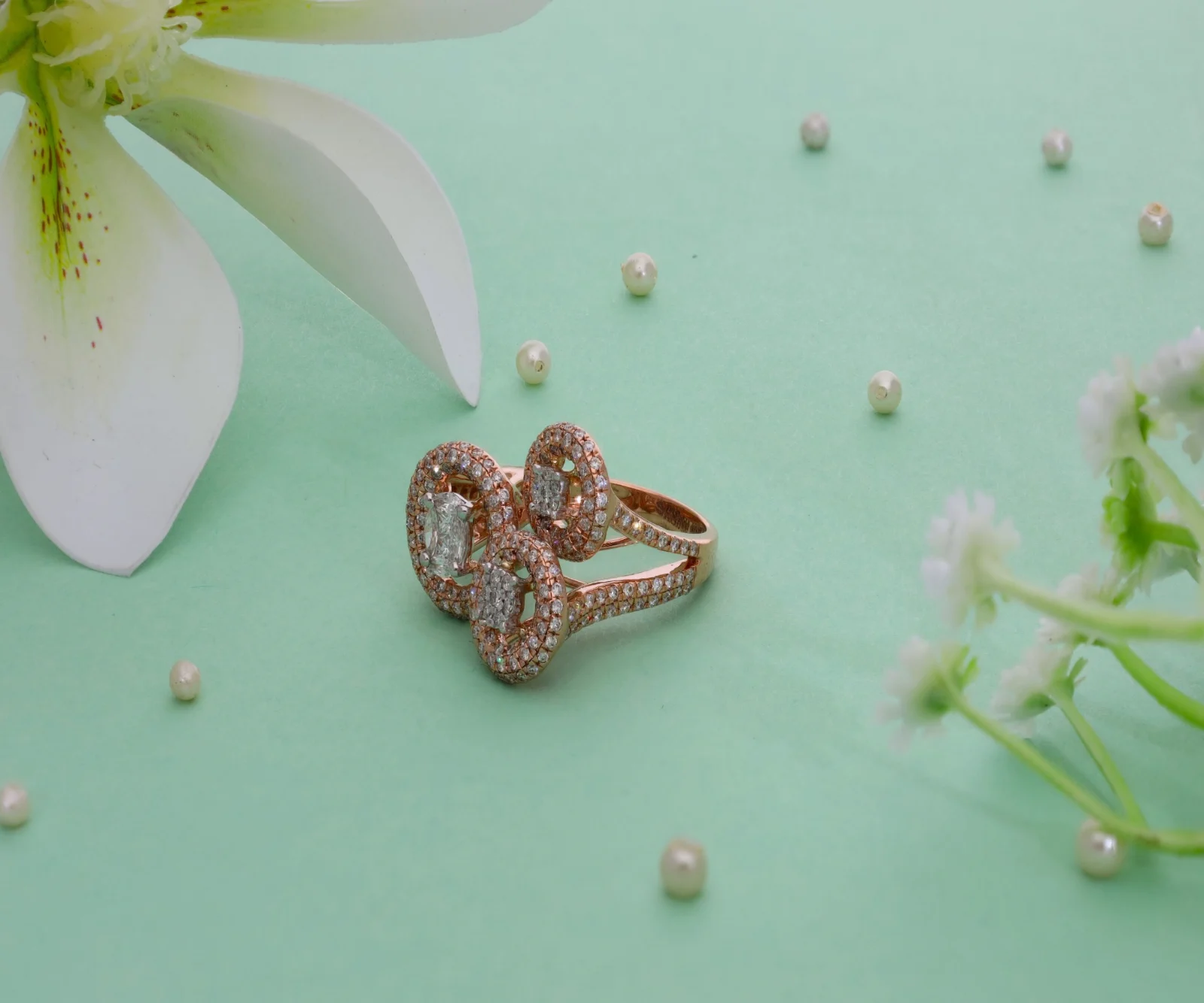
Rose gold on mint, with a lily and pearls
The pastel backdrop makes the rose gold glow, the lily frames the ring without covering it, and scattered pearls lead the eye in. A low three-quarter angle lets the side stones catch the light.
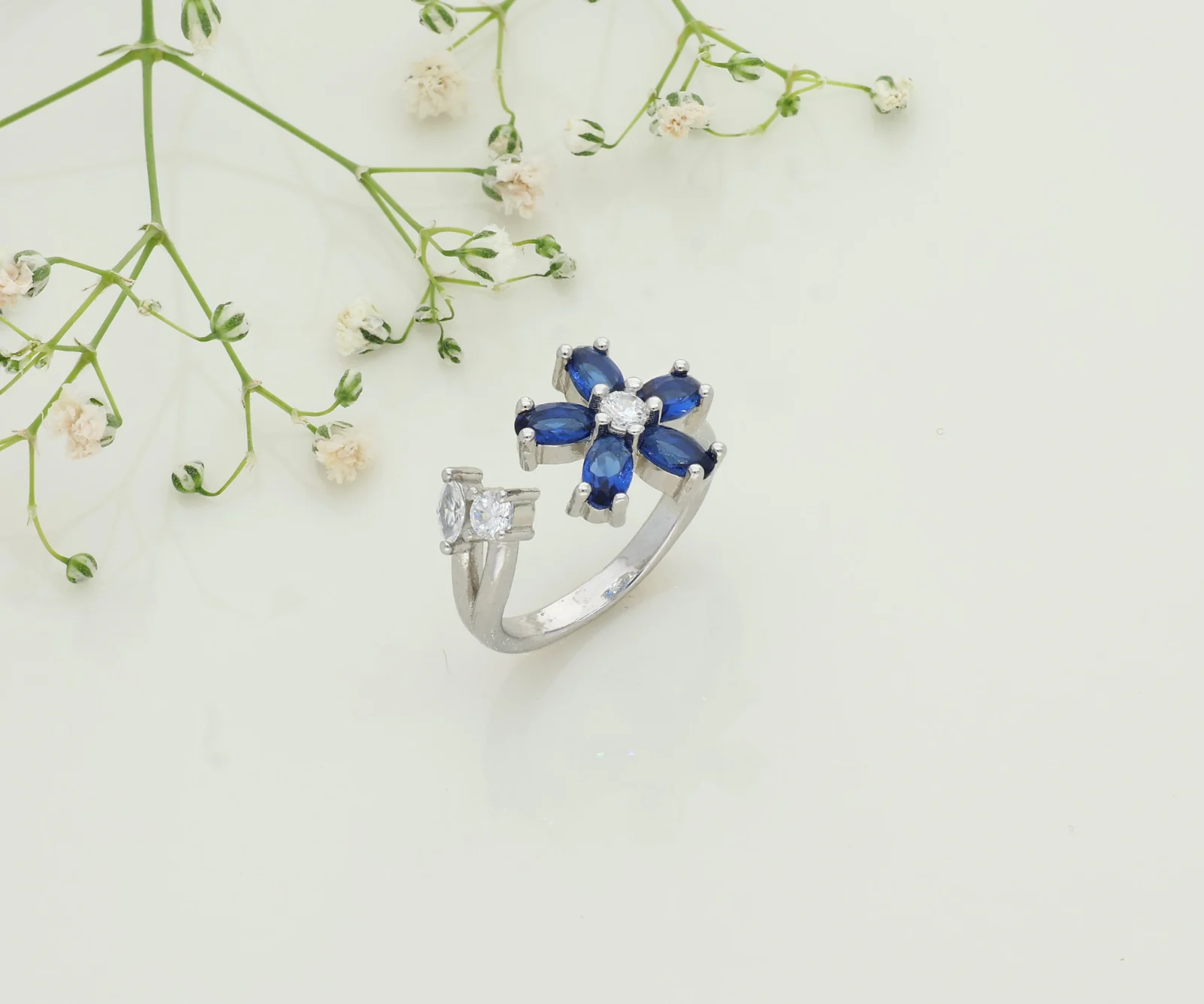
A flower ring on ivory, with baby’s breath
A near-white background keeps the blue stones vivid and the silver crisp. The sprig of gypsophila echoes the ring’s flower shape from the top corner, leaving clear space around the piece.
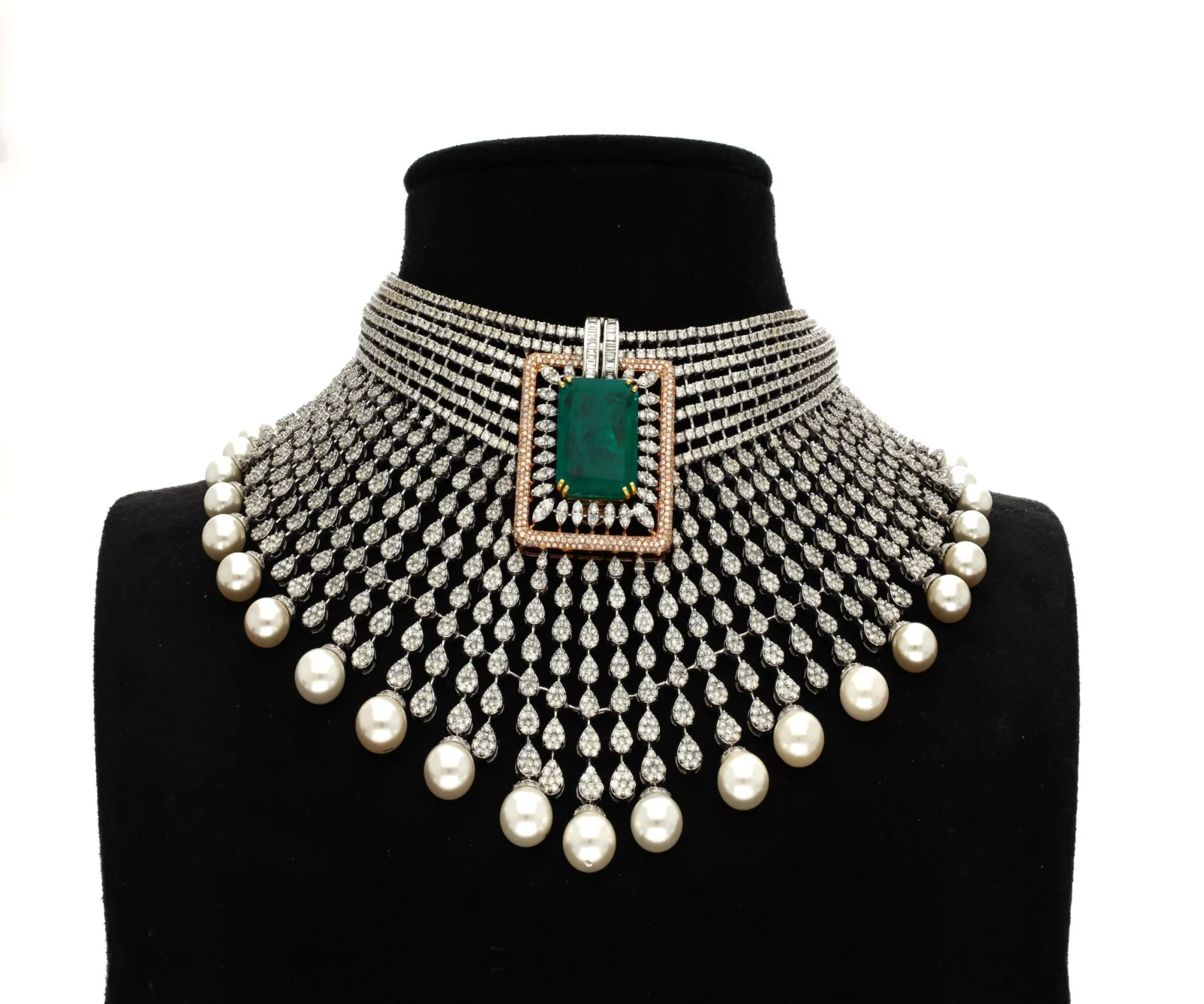
A statement choker on a black velvet bust
A bust shows exactly how a choker sits on the neck. Black velvet absorbs stray reflections, so every row of stones and pearl drop reads cleanly and the green centre stone becomes the focal point.
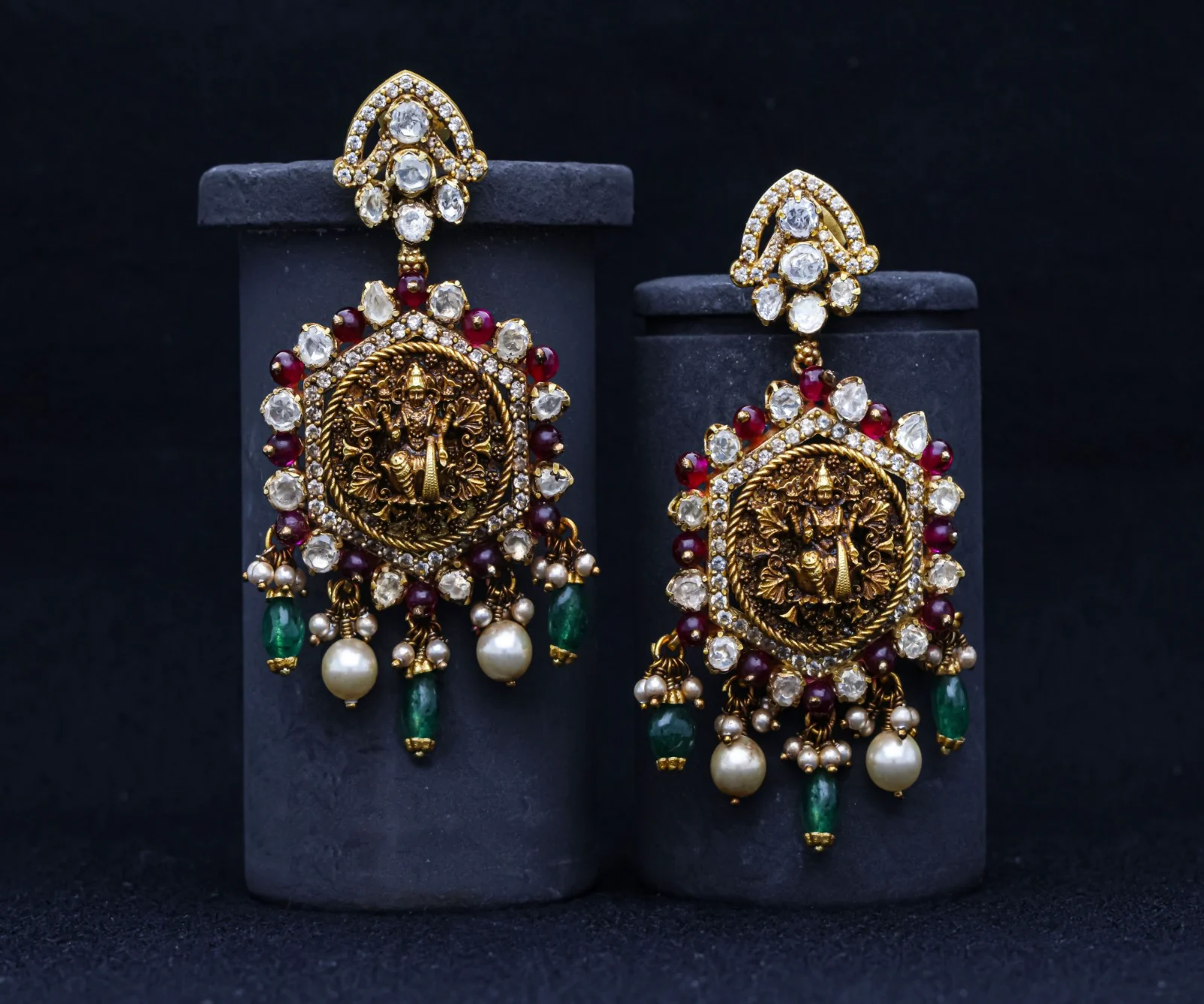
Temple earrings on staggered dark stands
Two stands at different heights give the pair depth and show both earrings in full. The dark backdrop lets the antique gold, red stones and pearl and bead drops stand out.
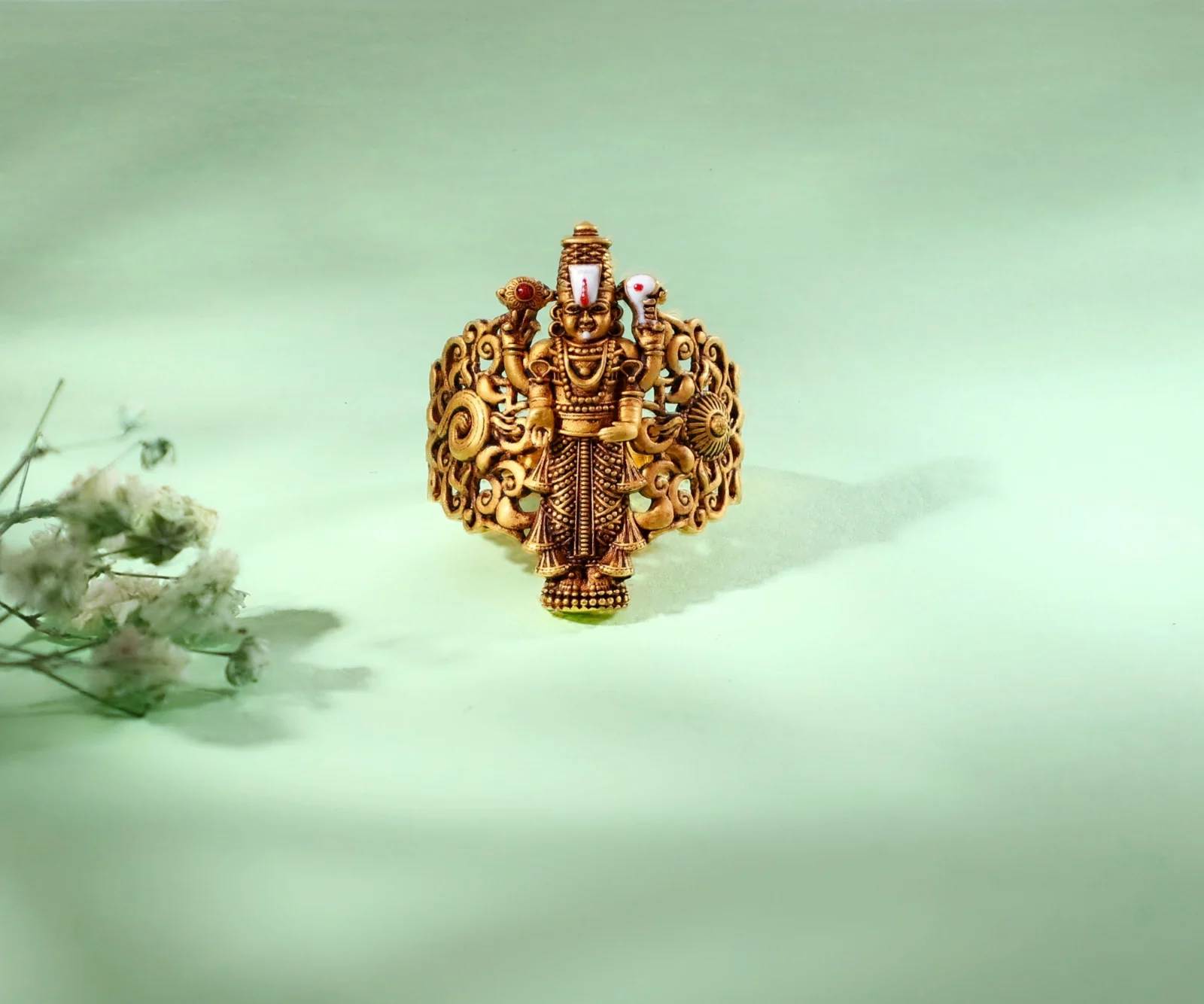
A single hero piece, props out of focus
One ring, centred, with dried flowers softly blurred in the foreground. The shallow depth of field keeps attention on the carving, while the prop adds colour and a sense of depth.
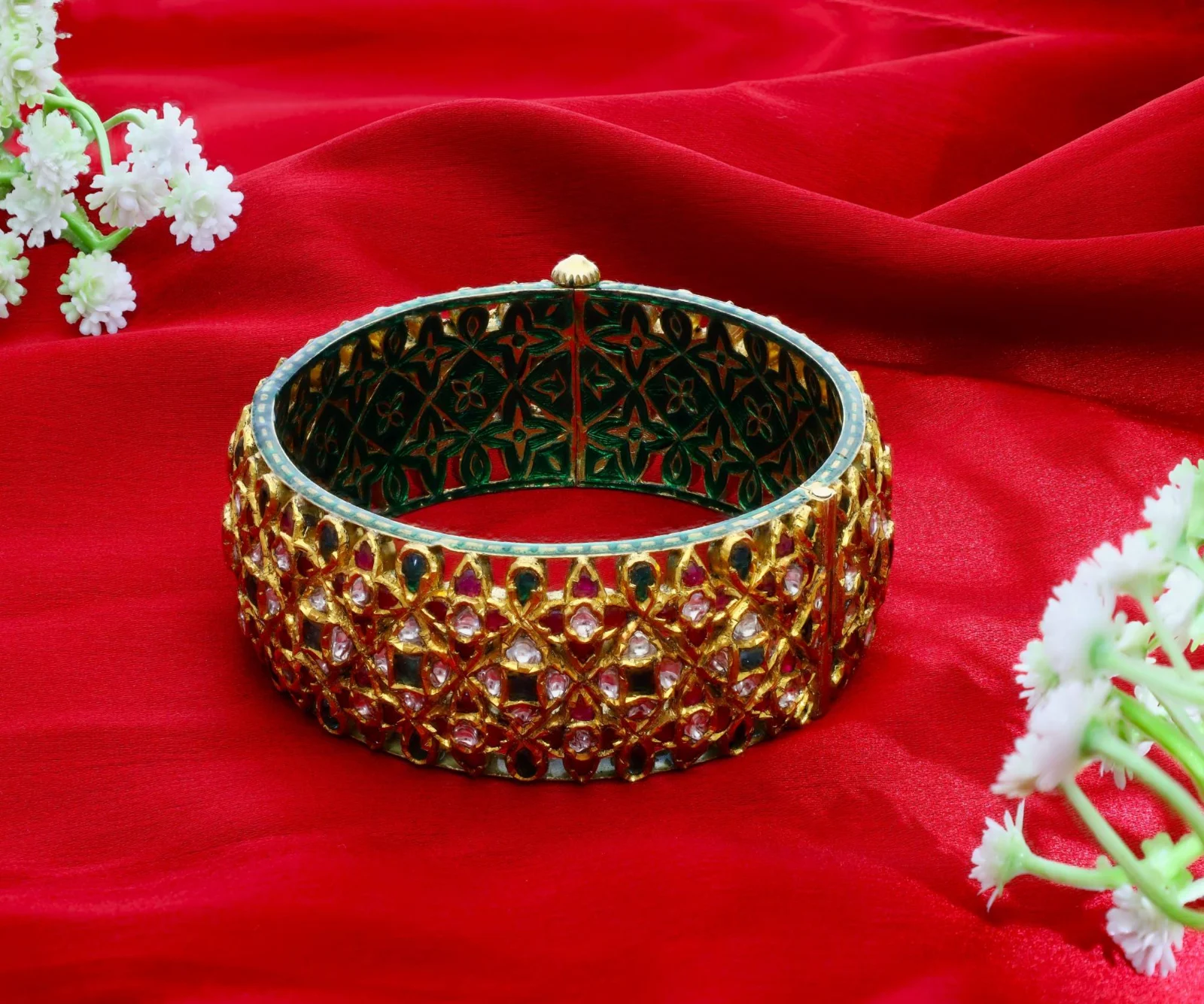
A kundan bangle on red silk
Red silk reads as bridal and festive instantly, and its folds add movement. The bangle is tilted to show the stone work on the outside and the enamel pattern on the inside in one frame.
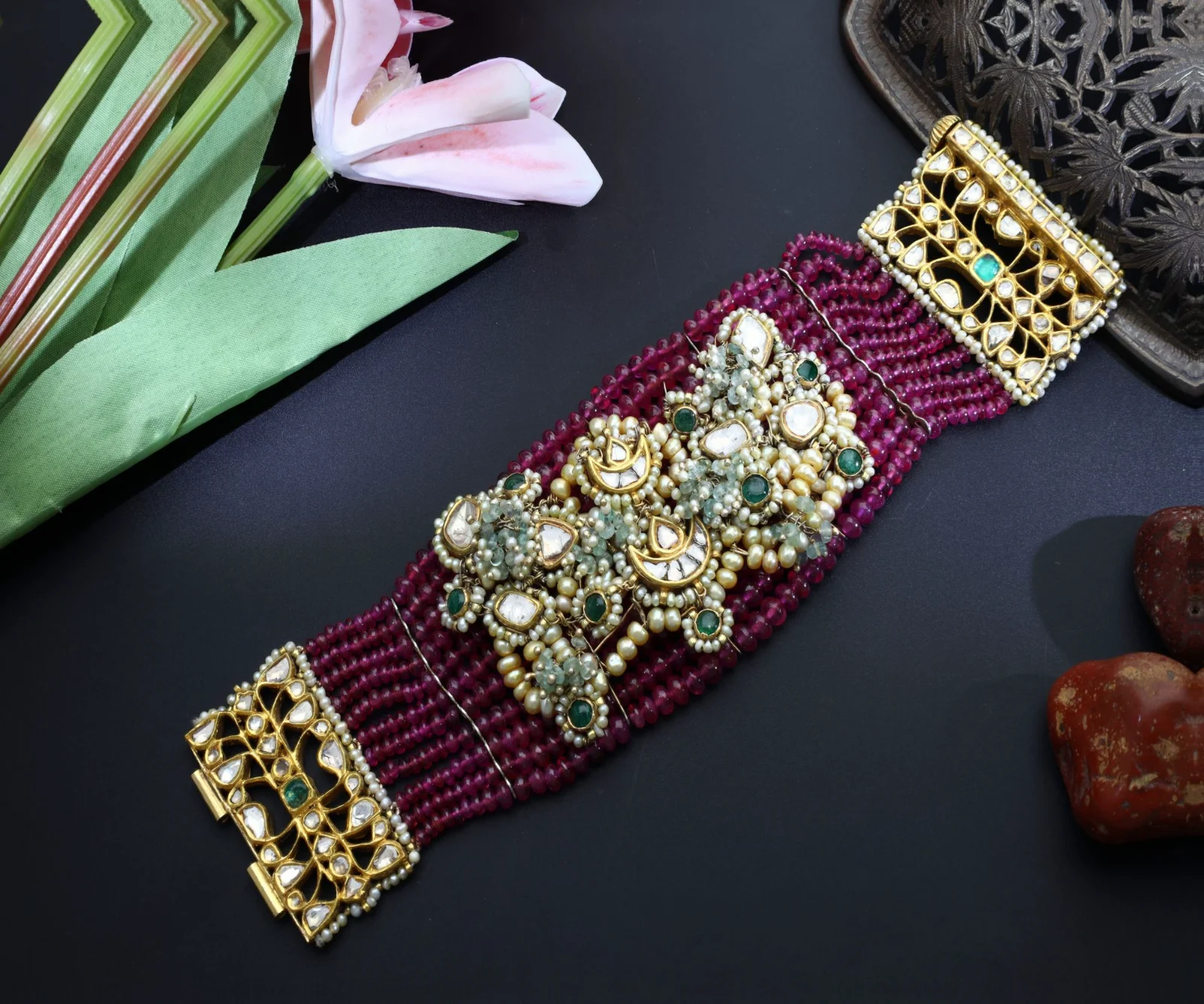
A bead bracelet as a flat lay
Shot from directly above on a dark surface, a flat lay shows the full length and every strand. A leaf, a lily and an antique tray fill the corners without touching the bracelet.
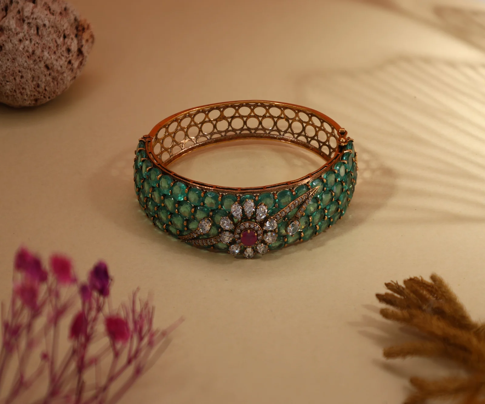
A green-stone bangle with leaf shadows
A leaf-shaped shadow across a warm beige backdrop adds atmosphere without adding clutter, and blurred flowers in the foreground frame the bangle so the scene feels natural.
Use props that point to the piece, not away from it
Props should add mood, scale or context — never compete with the jewellery. Flowers, pearls, silk, stones, leaves and antique trays all work, as long as they are softer, smaller or further from the camera than the piece itself.
Keep props to the edges of the frame, let them fall out of focus, and repeat a colour from the jewellery where you can — a pink lily beside red beads, green stems beside green stones. And leave space: a crowded set makes the piece harder to see, not more attractive.
Show how the piece is worn: busts, stands and risers
Necklaces and chokers look best on a bust or neck form, which shows their shape and drape the way a customer will see them in the mirror. Earrings hang naturally from stands, and a pair at two different heights adds depth to the frame.
Rings can stand upright in a slot or sit at an angle on a small riser; bangles and bracelets can lie flat, stand on their edge or rest over a prop. Whatever the display, keep it clean, neutral and free of scratches so it never draws the eye.
Light for sparkle, shape and true colour
- Use a key light to shape the piece and a softer fill to open up the shadows; a rim or back light separates jewellery from a dark background.
- Match the colour temperature to the metal: warmer light, around 3000K, flatters yellow and antique gold, while cooler light towards 6000K keeps diamonds, platinum and silver crisp.
- Use high-CRI lighting (90+) so stones keep their true colour — a green stone should look the same on every screen as it does in the hand.
- Let shadows do creative work: a leaf, a window frame or a patterned cut-out in front of a light throws a soft shape across the background.
- Diffuse the light on polished metal so gold shines without burning out to pure white.
Compose with depth and focus
Place the piece slightly off-centre or on a diagonal, and let props and empty space balance it. Shoot rings at a low three-quarter angle, flat lays from directly above, and earrings and chokers straight on at eye level.
A shallow depth of field, with foreground and background props softly blurred, keeps the eye on the jewellery. Make sure the piece itself is sharp from front to back, though: focus stacking, which blends several frames focused at different depths, solves this for intricate work.
Make a creative look repeatable across a collection
Creative shots are often one-offs: a look is found by trial and error, and it is gone as soon as the lights are moved. For a collection you want the opposite — the same mood on every piece, shot after shot.
An automated studio makes that practical. On the EasyCLIQ X1 and X3, ten independently controllable lights, adjustable from 3000K to 6000K at 90+ CRI, shape the highlights and warmth of a shot; the lighting and camera position are saved as a template and recalled with one click for the next piece; and focus stacking keeps every stone sharp. The same session can also produce the clean white-background images and 360° spins that online stores and marketplaces need.
A quick checklist before you shoot
- Clean and polish every piece, and handle it with gloves so no fingerprints reach the metal.
- Iron fabrics, dust backdrops and check props for marks and loose threads.
- Set the white balance for the metal, and check stone colour on screen against the real piece.
- Take a wide shot and a detail shot of every setup.
- Shoot a white-background version of the same piece for your store and marketplaces.
- Export sizes for each channel: square for feeds, vertical for Stories and Reels, wide for banners.
Bring your collection to life
Creative photography is where a jewellery brand shows its personality — the colours, textures and moods that make a customer stop scrolling. Planned well, with props that support the piece and light that flatters it, it does not need a large studio or a professional crew.
To see how an EasyCLIQ studio handles your own jewellery, book a free demo and bring a piece or two from your next collection.